
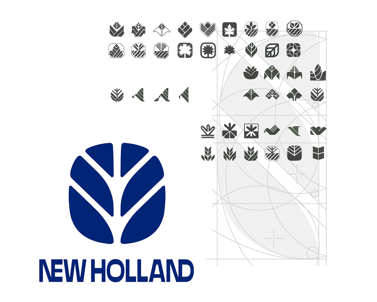
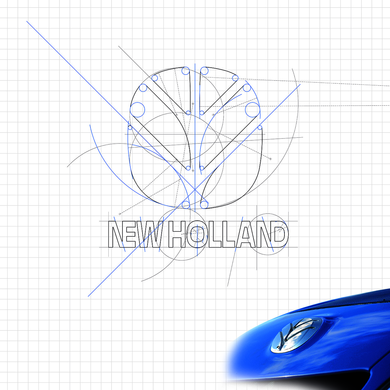
NEW HOLLAND – LEAF LOGO
Nel 1985 il settore di produzione di macchine per l’agricoltura del Gruppo Fiat viene unito nel nuovo Brand Fiatagri, per il marchio viene incaricato Carmadesign. L’analisi del mercato rivela che i marchi dei principali concorrenti sono composti da logotipo e simbolo. Lo spazio libero per crearne uno nuovo era ristretto, la scelta è stata comunque di adottare stesso schema: logo + simbolo, per la sua forte capacità di comunicazione. Il nuovo simbolo è stato guidato dall’idea di evocare in modo fortemente sintetico la natura, una forma elementare e universale: la foglia. La posizione delle nervature evoca anche l’impronta sul terreno dei pneumatici dei trattori. Forma, valori dei vuoti e dei pieni, sono funzionali al suo utilizzo in 3D sul prodotto: centro volante, centro ruote, centro cofano, parafanghi, ecc.; con le svariate tecniche industriali: punzonatura, rilievo, stampaggio, timbratura, termoformatura. A completamento del progetto, Carmadesign ha redatto 8 manuali del Brand Identity, dove sono raccolte le linee guida delle applicazioni che formano l’immagine. Nel 1995, a seguito del “merger” aziendale con il settore delle macchine per l’agricoltura del Gruppo Ford; Fiatagri diventa New Holland. Il logo è sostituito con quello originale della marca americana mantenendo la foglia a testimonianza della continuità. Nel 2007 è stato fatto l’attuale restyling sempre con il simbolo: la foglia. Questi passaggi confermano che un segno forte, sopravvive e attraversa ogni tipo di trasformazione dei brands.
In 1985 Fiat Group agricultural machinery production enetered the new Fiat Agri Brand; Carmadesign is charged for the creation of the new brand. The market survey reveals that the main competitor brands are made of logos and symbol. There was restricted space for a new creation, but in any case it has been decided to choose the same model: logos+symbol, because of its strong way to communicate. The idea that moved to the new symbol was to concisely recall nature, an elementary and universal shape: the leaf. The position of the keels remind the track on the ground of tractors’ tires. The shape, full and empties, are functional for its tridimensional use of the product: in the centre of the steering wheel, in the centre of the wheels, of the hood, of the fenders, etc; it is useful also for all the industrial processes: stamping, relief, press, thermoforming. To complete the project, Carmadesign has edited 8 manuals/books for Brand identity in which are collected the application guidelines to create the image. In 1995, after the Company “merger” with the Ford Group agricultural machinery area, Fiat Agri becomes New Holland. The logo is changed with the original one of the American brand, keeping the leaf as evidence of continuity. In 2007 it has been the current restyling, with the symbol again: the leaf. All these steps are the guarantee that a strong symbol can survive and go through every brand transformation.